GEMMER Documentation
Introduction
GEMMER (GEnome-wide tool for Multi-scale Modeling data Extraction and Representation) aims to generate publication-quality visualizations of interactions between protein-coding genes in Saccharomyces cerevisiae and serve as a data-integration hub.
In addition to being an acronym as described above, the word "gemmer" refers to mining of gems (see the Merriam-webster definition), e.g. precious stones, which we thought apt to the process of discovering new biological insights which we hope GEMMER facilitates.
The visualizations are genome-wide and multi-scale in the sense that the visualizations allow compartment localization, cell cycle transcription and functional data to be projected onto the network using data from various other databases. Furthermore, all this data may be inspected online and downloaded at the user's convienence. After generating datasets and visualizations using GEMMER, the user may download the data and readily import it into for example Cytoscape for further analysis and ultimately model building.
GEMMER aids (modeling) research by providing:
- Effortless data integration from 3 databases
- SGD (Saccharomyces Genome Database)
- CYCLoPs (Collection of Yeast Cells Localization Patterns)
- YeastGFP (Yeast GFP Fusion Localization Database)
- SCEPTRANS (Saccharomyces Cerevisiae Periodic Transcription Server)
- Specifically, we use the peak cell cycle phase transcription data from: M. Rowicka, A. Kudlicki (equal author), B. P. Tu & Z. Otwinowski: 'High-resolution timing of the cell-cycle regulated gene expression', PNAS 104, 16892 (2007). doi: 10.1073/pnas.0706022104
- Interaction networks with localization, abundance and transcription timing information incorporated
- Centered around one or more genes
- Data visualization using interactive D3 (not 3D!) drawings
- With various filtering possibilities
- Data export for interaction networks to SVG, JSON, GEXF and Excel
- Excel and GEXF export formats may be imported for further analysis into Gephi and Cytoscape.
GEMMER Workflow
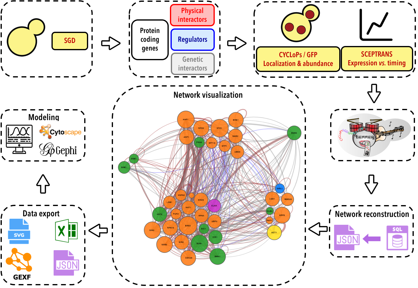
The database
All of the data GEMMER uses to visualize interaction networks is stored in an SQLite database.
Building the database
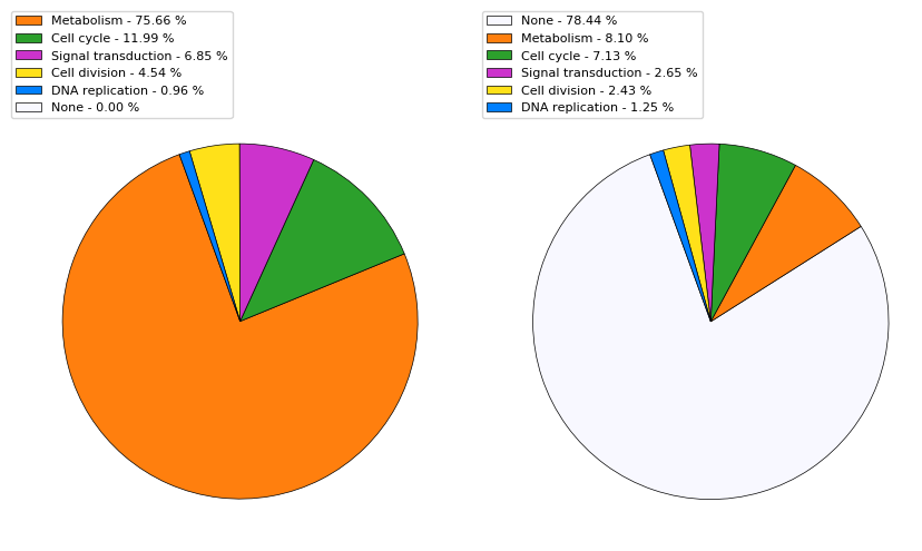
Assignment of primary and secondary function through GO terms
GEMMER predicts functions for protein-coding genes using GO term annotations in SGD. Using YeastMine we collect all GO term annotations for each protein-coding gene in SGD that trace back to one of the following "high-level" GO terms:
- Cellular metabolic process GO:0044237
- Cell cycle GO:0007049
- Cell division GO:0051301
- Signal transduction GO:0007165
- DNA replication GO:0006260
All these terms fall under the GO term cellular process, and DNA replication falls under cellular metabolic process.
We assign each such GO term annotation to one of the high-level terms listed above. For each gene we add up how many annotations fall under each high-level GO term. The one with the highest count is then assigned as the gene's primary function, the second-highest count gets assigned as the secondary function. The pie chart below displays the distribution of the primary and secondary functions/GO terms across the genome-wide collection of ~6800 protein-coding genes.
Interacting with the database
Genome-wide search
Through the database page users may inspect the data GEMMER collected from SGD, CYCLoPs, YeastGFP and SCEPTRANS on a per gene basis. The entire genome-wide collection of protein-coding genes may be searched through the search form on the database page.
Information for a specific gene
On the page for a specific gene, i.e. SIC1, users have access to descriptions of the gene (from SGD), GEMMER's functionality predictions based on GO terms from SGD, CYCLoPs/YeastGFP localization and abundance data if available, timing and cell cycle phase of peak transcription from SCEPTRANS and the set of genes it interacts with. The table of interactions allows the user to move on to pages specific for the interactors, search the interactors, and links directly to PubMed to retrieve the original publication where the interaction was shown.
Visualizing a network
Technical details
The central access hub for the tool is formed by the index.php webpage. The form on this page allows user input, e.g. which gene(s) to center the visualization around. An AJAX script submits the form for processing and displays a brief message to the user. Once submitted a PHP processing page makes sure the input is not faulty and if everything checks out executes a Python script 'gen_visualization'. Once this script is done it will have generated a JSON file with the necessary information for the visualization. The user is then automatically forwarded to a new page with a "box" for the visualization with an embedded D3 visualization based on the JSON file. This page also contains download links for an SVG image of the visualization and an Excel file with all the information on the visualized genes and their interactions. Furthermore various tables with this information are also displayed on the page.
Using the form to build an interaction network visualization
The visualization page contains a form that is to be used to query the database for a specific interaction network satisfying your requirements.
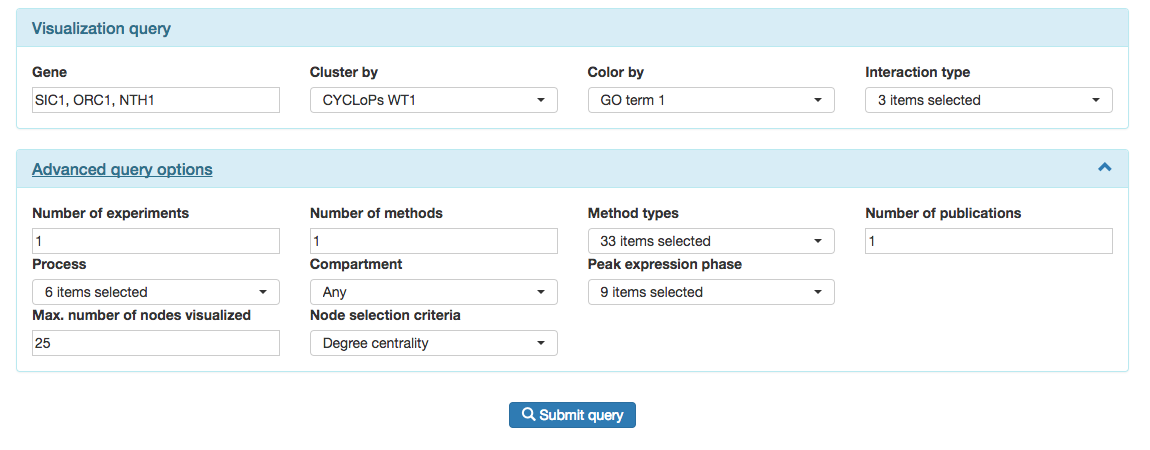
The form is split in two parts: the core "Visualization query" and the "Advanced query options".
In the "Visualiations query" area users select the genes they wish to base the interaction network on. Note that if one fills in one gene, e.g. SIC1, the result is a network of up to 25 genes that interact with SIC1. If one fills in two genes, e.g. SIC1 and NTH1, the result is a network of up to 25 genes that might interact with either or both of these genes. GEMMER selects which genes end up in the ultimate visualization based on a "node selection criteria" under the "Advanced query options".
The rest of the "Visualization query" deals with whether or not to cluster ("Cluster by") and color ("Color by") the nodes in the visualization, and which types of interactions to consider. Without clustering, the visualized network will resemble the "hairball" networks. If clustering is enabled, this may be done on functional assignment, e.g. metabolism (see above) or on localization according to the CYCLoPs database. The CYCLoPs database contains records for 3 wild type experiments referred to in GEMMER as WT1, WT2 and WT3.
The "Color by" option is similar to the "Cluster by" option.
The interaction type dropdown menu allows users to filter out genetic interactions for example. Or, to focus only on regulatory interactions.
The "Advanced query options" contains various ways to filter out results.
In the first row users may filter either by the specific experimental method that was used to show an interaction or by the number of experiments (one or more per publication), publications or the number of unique different methods that were used in the literature to show an interaction.
The second row of the "Advanced query options" contain further filtering approaches based on the functional process of the interactors, the compartments they are expressed in or the phase of their peak expression. For the "Compartment" option, users may select any of the CYCLoPs or YeastGFP compartments to filter for. For example, using this option a user may build a query which will only return interactors that are expressed in the nucleus according to any of the three wild type CYCLoPS experiments.
Finally, the last row contains node filtering criteria. The first option "Max. number of nodes visualized" sets the maximum number of genes that will be shown in the visualization. This is by default set to 25, and can be increased to 100. We limit this because past this point the strain on the browser becomes quite significant and the screen becomes too crowded to clearly show the gene names in the nodes. If more nodes are required, users may click on the "D3.js max. 250 nodes" layout under the heading "Alternative network visualizations" below the visualization. This layout will shown up to 250 genes but lacks gene identifiers within the visualization to make space for more nodes. However, the genes may still be identified by clicking on them in the visualization, after which their information will show up in the sidebar.
When a query returns more than the max. number of nodes set in the form, GEMMER needs to decide which genes NOT to show. GEMMER does not do this randomly. The last option in the form allows users to choose how GEMMER filters such genes: based on degree centrality, eigenvector centrality or Katz centrality.
All these filters may be used together to build very complex queries.
Example visualizations
Once the form discussed above has been filled, clicking "Submit query" will launch the visualization. This might take somewhere in the range of 1-10 seconds based on the number of genes and interactions that satisfy the requirements specified in the form.
To illustrate the potential networks, layouts and biological questions GEMMER supports, we gathered together a set of example visualizations that highlights many of the settings and visualizations that GEMMER provides.
Data export and further analysis
GEMMER provides export of the data for each visualized network in JSON, Excel and GEXF formats. These are available below the visualized network under the "Export options" header.
Further analysis in Cytoscape
Cytoscape is a desktop application that provides many additional functionalities beyond those present in GEMMER, especially through its plugin apps. To that end, it is useful to do exploratory analysis and visualization with GEMMER, export the data and import them in Cytoscape.
To import a visualized network in Cytoscape: download the Excel file through GEMMER from the visualization page, then in Cytoscape click “import > network > file”. This yields the same network in Cytoscape. Crucially, the user has to select the “interactome” sheet to import.
Further analysis in Gephi
Gephi is another desktop application providing advanced network analysis capabilities. To open networks visualized with GEMMER in Gephi both the Excel and GEXF export formats may be used. To import an Excel file in Gephi: go to "Import spreadsheet" > click the Excel file downloaded from GEMMER > select the interactome sheet > import as edges table.
Dependencies
GEMMER would not be possible without the following open-source projects: